Apple VIP Mailbox
Streamlined VIP contacts message access taps for Apple Mail users through improved mobile contact filtering.
Apple Mail has become a staple email client for millions of users across Apple devices. But have you ever felt the frustration of diving into different Apple Mail versions and clicking away to locate specific VIP messages? The VIP experience lacks consistency across its implemented platforms. This project addresses this miss for the iPhone Mail app specifically by proposing a simple solution to view and manage specific VIP contacts conveniently.
Users desire more granular control over VIP contact filtering, especially as users can only see and filter specific VIPs easily on desktop’s Mail app.
A granular user experience improves user satisfaction, reduces number of clicks, and eases using the dedicated VIP contacts mailbox.
By utilizing existing UI components - specifically from Apple Stocks - this design can seamlessly integrate with the current Mail app.
Increased VIP feature adoption
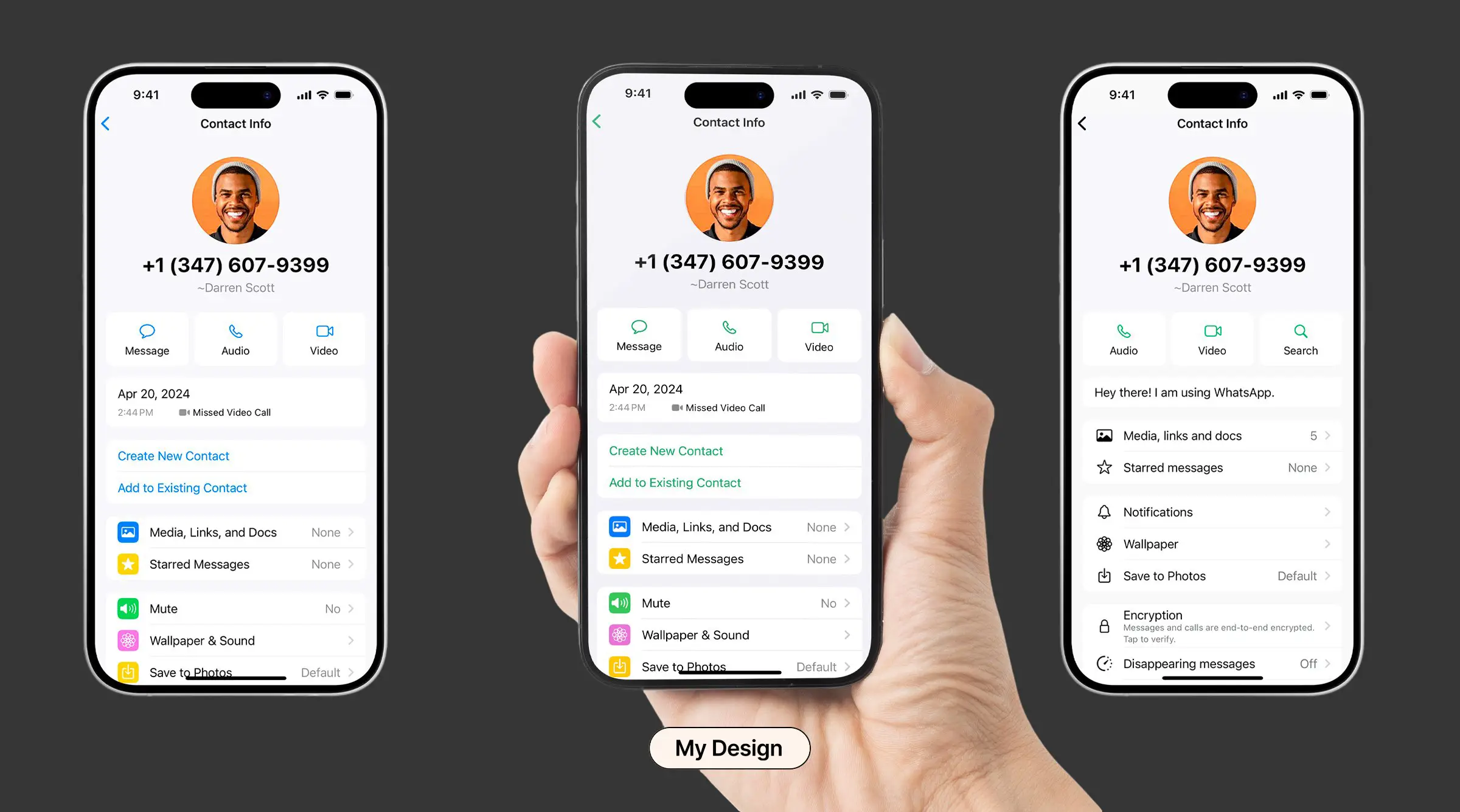
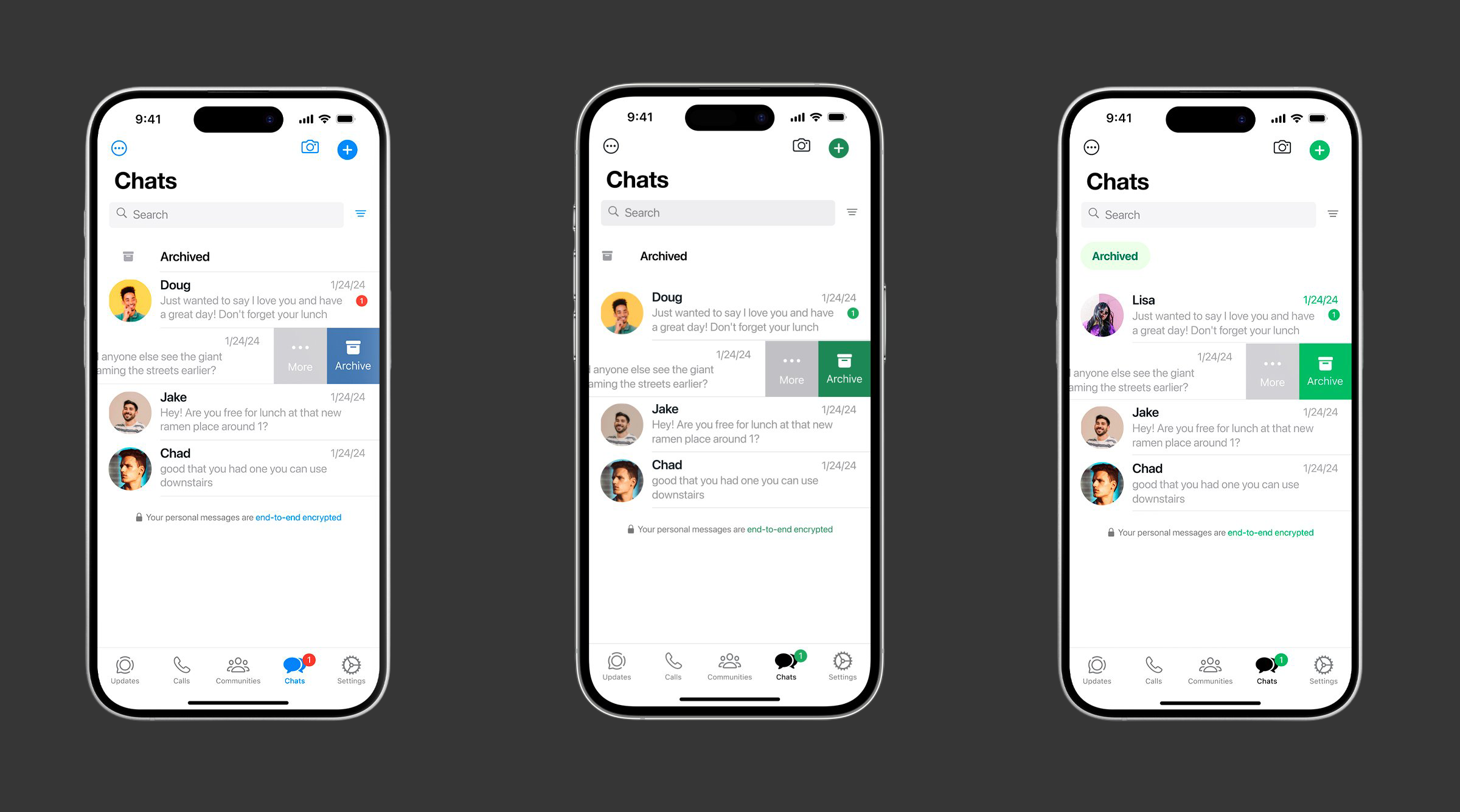
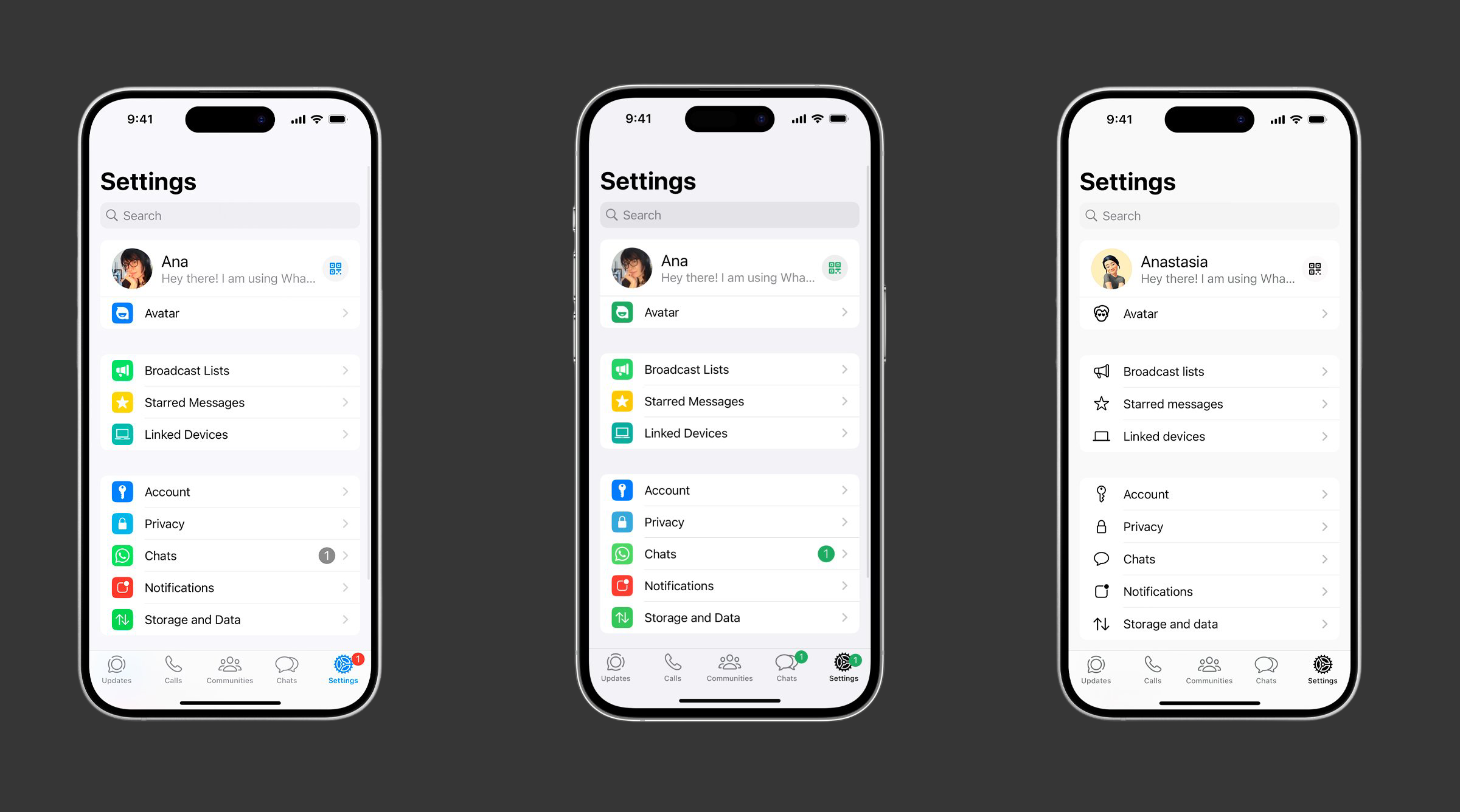
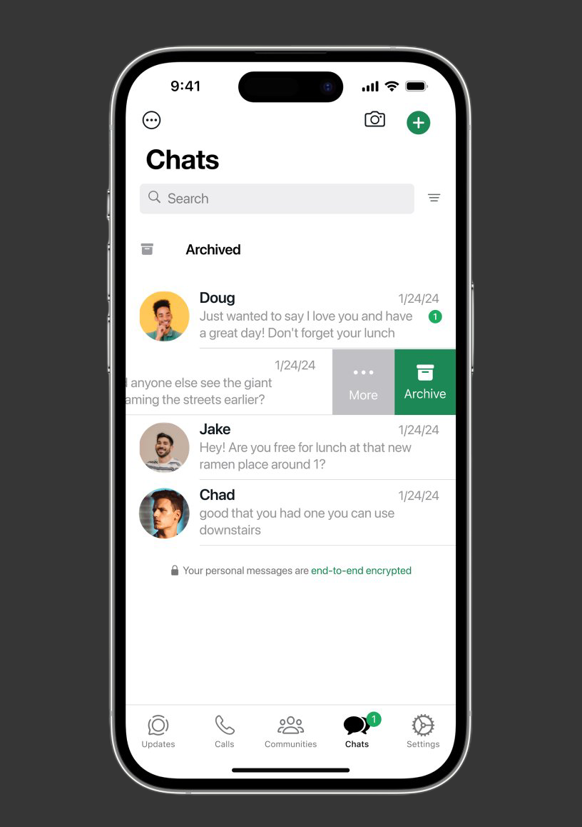
Apple Pinned Threads
Enhanced messaging efficiency for iOS users with adaptive pinned conversation interface supporting 12 contacts.
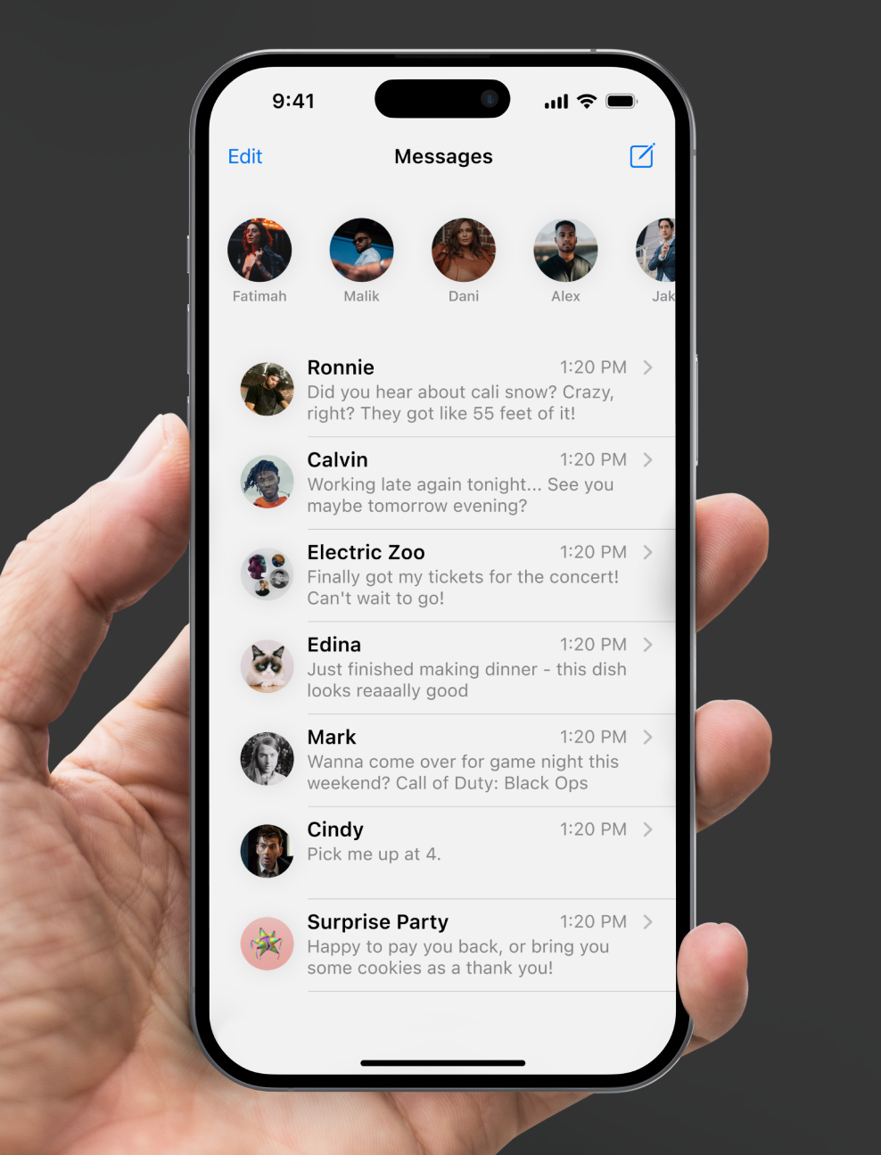
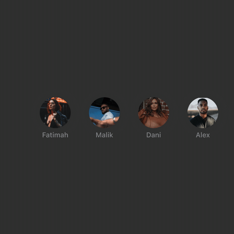
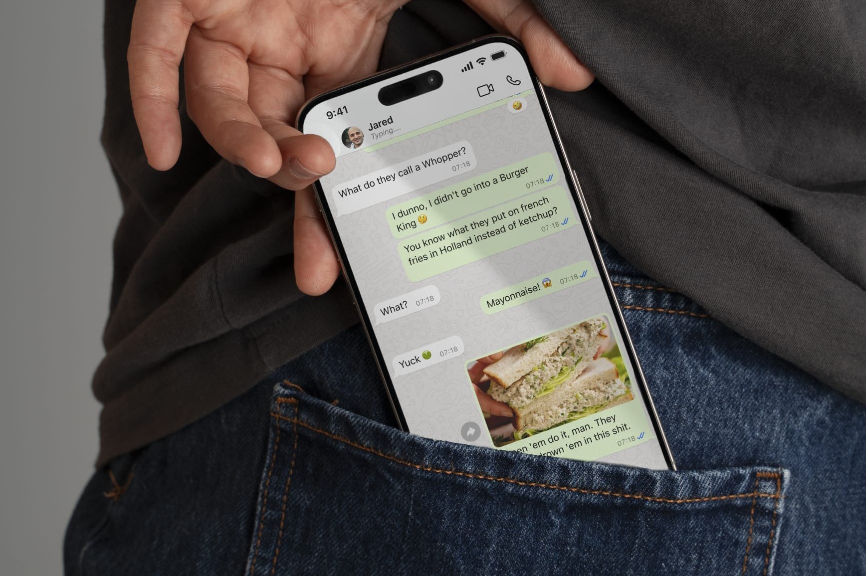
Pinned conversations are convenient, but they can quickly clutter the interface, especially when all nine slots are in use. I addressed this by designing a space-efficient solution that dynamically adjusts the icons based on the number of pinned threads, drawing inspiration from common gesture-based interactions and user trends, such as in Facebook Messenger. This approach preserves core functionality while maximizing screen real estate.
"It can be risky to choose a pattern if we don't fully understand why that pattern was originally designed to our audience. Choosing a pattern, because it is widely understood can be a great way to build the case for your decisions." - Designing Interfaces (O'Reilly)
Key decision decisions included:
•
The size of pinned conversation icons adapts based on the pinned contact count, ensuring efficient use of space, allowing up to 12 contacts.
•
Users can swipe left or right to access more of their pinned contacts, offering a familiar and efficient design pattern.
•
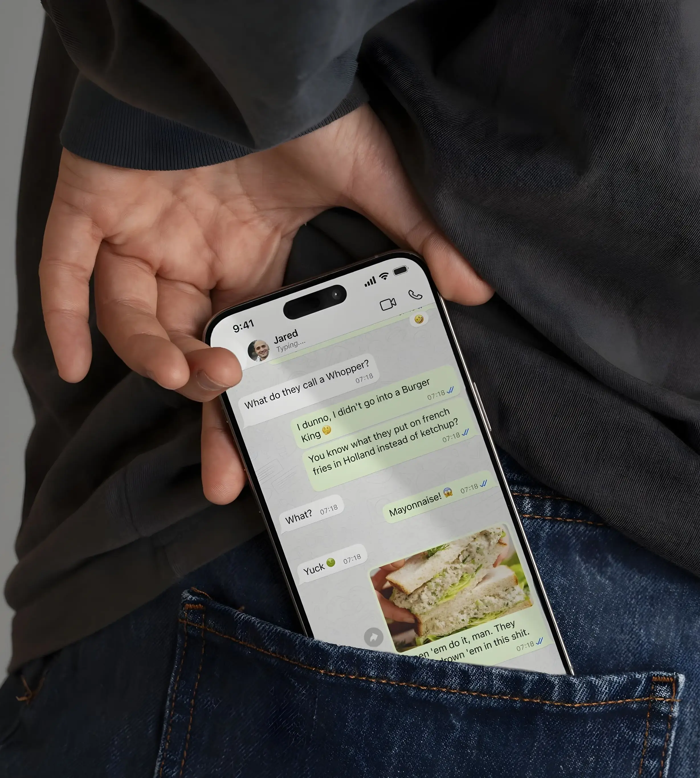
Each pinned convo displays the name, text count, and typing indicator, providing essential information without cluttering the interface.
•
Your message center only displays new messages, keeping the your messaging center clean and hiding conversations after reading them.
Improved feature retention
Intelligent resizing scales avatars based on pinned contact count, supporting 12 threads total. Intuitive left and right swiping provides familiar navigation using proven interaction patterns (Facebook Messenger).
WhatsApp iOS Theme
Strengthened brand identity for iPhone platform users for WhatsApp with a branded theme implementation.
This project focused on creating a fresh, branded iOS theme for WhatsApp on iOS that aligns with its green color scheme while modernizing the interface. The iPhone app boasted "Apple Blue" as the primary color. The goal was to enhance brand consistency across platforms, drawing inspiration from the existing Android theme. This involved carefully selecting typography and iconography that incorporated the brand colors and ensured a cohesive user experience across both iOS and Android.
Many users prefer themes, or skins, that align with an app's branding. This theme provides a cohesive experience for WhatsApp users.
A branded theme can strengthen brand identity and increase user engagement. Businesses have a responsibility to keep their experience consistent.
This design concept was validated when WhatsApp subsequently launched a new iOS theme using their brand colors and new iconography.
Strengthened brand identity
Chase Fraud Alerts
Improved customer confidence in fraud resolution for Chase Bank users with a clear next-step text and app strategy.
This project tackled reframing Chase Bank's fraud alerts to provide a more reassuring notification experience for customers that were left confused or uncertain by them. After confirming the charges were fraud with the bank, no further notifications were received by the user*, leaving them uncertain about what actions the bank was taking. Examples might be canceling the card, and if so, whether and when a new card was going to be processed.
Chase Fraud: We declined $381.93 with card ending in 7681 at TOYS R’US. Was this you? Reply YES or NO. If yes, you will not be charged unless you try again. If no, we will close your current card and send you a new one. Msg & data rates may apply.
[Reply: No]
Chase Fraud: Was this you? We declined a $381.93 purchase at TOYS R'US with card ending in 7681. If you do not recognize the charge reply NO and a new card will be issued to you. If this was you reply YES, and you will not be charged unless you try again. Msg & data rates may apply.
[Reply: No]
Thank you for confirming. We've canceled your card. We’ll notify you when your new card ships.
Chase Fraud: We declined $381.93 with card ending in 7681 at TOYS R’US. Was this you? Reply YES or NO. If yes, you will not be charged unless you try again. If no, we will close your current card and send you a new one. Msg & data rates may apply.
[Reply: Yes]
Chase Fraud: Was this you? We declined a $381.93 purchase at TOYS R'US with card ending in 7681. If you do not recognize the charge reply NO and a new card will be issued to you. If this was you reply YES, and you will not be charged unless you try again. Msg & data rates may apply.
[Reply: Yes]
Thank you for confirming. You can continue using your card.
Customers need to feel confident that the bank is taking appropriate steps to protect their accounts and resolve the issue.
Minimize support requests and improve overall customer satisfaction by providing clear and informative communication.
There is a growing importance of UX writing in creating positive and user-centered experiences, particularly in sensitive situations like fraud alerts.
Reduced fraud-related support calls, improved customer confidence
Google Messages Filter
Enhanced messaging privacy for Android users with intelligent AI/ML spam filtering and user-controlled recovery flows.
The demand for effective spam filtering tools is evident, with surveys revealing 68% of consumers are interested in using automated filtering tools to block spam messages.
"With 162 billion spam messages flooding inboxes globally each day and Americans losing $330 million to text scams in 2022 alone, unwanted messaging has become a critical digital safety issue." -Gemini Analytics
•
The pervasive nature of spam across billions of daily messages highlights a massive addressable market for effective filtering solutions.
•
A cleaner, more secure inbox directly translates to a better user experience, potentially increasing engagement and loyalty for messaging platforms.
•
Offering a superior spam filtering solution can differentiate Google Messages in a crowded communication app landscape.
I designed a filtering feature that automatically analyzes incoming texts, shielding users from spam and their associated notifications, and allows inbox management with finer control.
Users are overwhelmed by spam, seeking automated tools to declutter their inbox and avoid fraudulent messages.
Boost user satisfaction and loyalty, reduce operational burdens, and gain a competitive advantage, by keeping up with user needs.
Leveraging advanced AI/ML capabilities, this project aligns with the growing adoption of AI-driven features in daily tech.
Increased lifetime value across product suite
Gemini AI for Job Seekers (Moonshot)
Reduced job search anxiety for Gmail users with empathetic Gemini-driven job app communication summaries.
Addressing the significant emotional and practical challenges faced by millions of job seekers, this project conceptualized an innovative Gmail extension powered by Gemini AI. The primary goal was to streamline job application management and alleviate anxiety by providing personalized, empathetic summaries of job-related emails in a way that does not sound repetitive and automated. This concept directly responds to my own struggles.
Smart AI detection will trigger an application tracking option for automated job emails. Then,aAn overlay displays over Gmail, confirming tracking, after selecting “Track responses…”
When a company responds, Gemini AI delivers empathetic company response summaries directly to users' active device viewport. Each message is uniquely personalized, ensuring no repetitive or automated-feeling communications.
Job seekers face overwhelming anxiety from rejections, information overload, and a lack of support, needing efficient and empathetic communication.
Leverage AI for market growth in productivity tools, enhance Google's ecosystem, and improve user retention through empathetic solutions.
Capitalizing on the rapid adoption of GenAI, this project leverages AI's emotional intelligence for personalized user experiences.
New market opportunity in AI-powered emotional support
Facebook Marketplace
Reduced listing churn for Facebook Marketplace sellers with new, flexible pause/unpause listings management.
This design exercise explores a ‘pause’ button for Marketplace, allowing users to temporarily hide a listing without having to delete it. This feature addresses a need for flexibility in managing ads, enabling sellers to take breaks when life gets in the way.
Whether it's a getaway, a family emergency, or simply wanting to delay sales until later in the week, users can easily deactivate their listing and reactivate it whenever they're ready to re-engage with potential buyers, and answer "Is this still available?"
Addresses real-world seller needs with minimal development complexity
Simple pause/unpause toggle instead of complex ad management
Reduced listing churn
Samsung System Icons
Modernized Samsung One UI system icons with refreshed aesthetic that maintains brand recognition and familiarity.
This design exercise explores a system icon refresh for Samsung's One UI 6, balancing modern design trends with brand consistency. The redesign addresses the need for visual evolution within Samsung's design system while preserving its recognized iconography. Softer, more organic shape with variable curvature - the corners flow more gradually into the sides, creating a "squircle" effect that's less structured.
"One UI app icons have square backgrounds with smooth rounded corners and outlines. Rounded squares allow enough room to showcase easily-recognizable symbols, while the curved corners make the icons seem softer and more inviting." - Samsung Design
Whether it's aligning with contemporary iconography standards or embracing current design aesthetics across Samsung's ecosystem, users see an experience with more cohesive system icons that feels familiar to the rest of the One UI 6 design.
Updated icons that reflect the other Samsung One UI 6 components
Softly rounded square backgrounds with refined edge treatments
Enhanced brand consistency, improved user interface cohesion