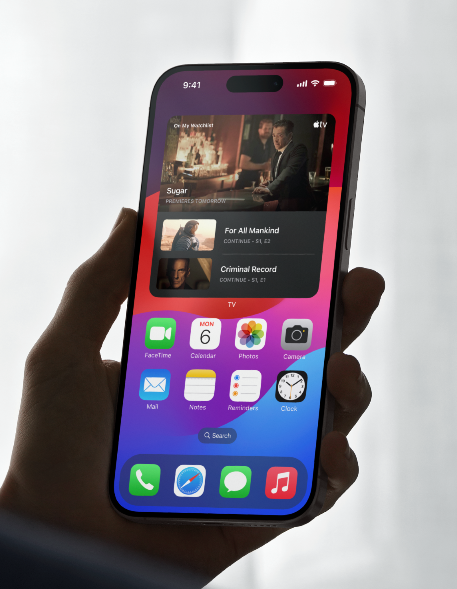
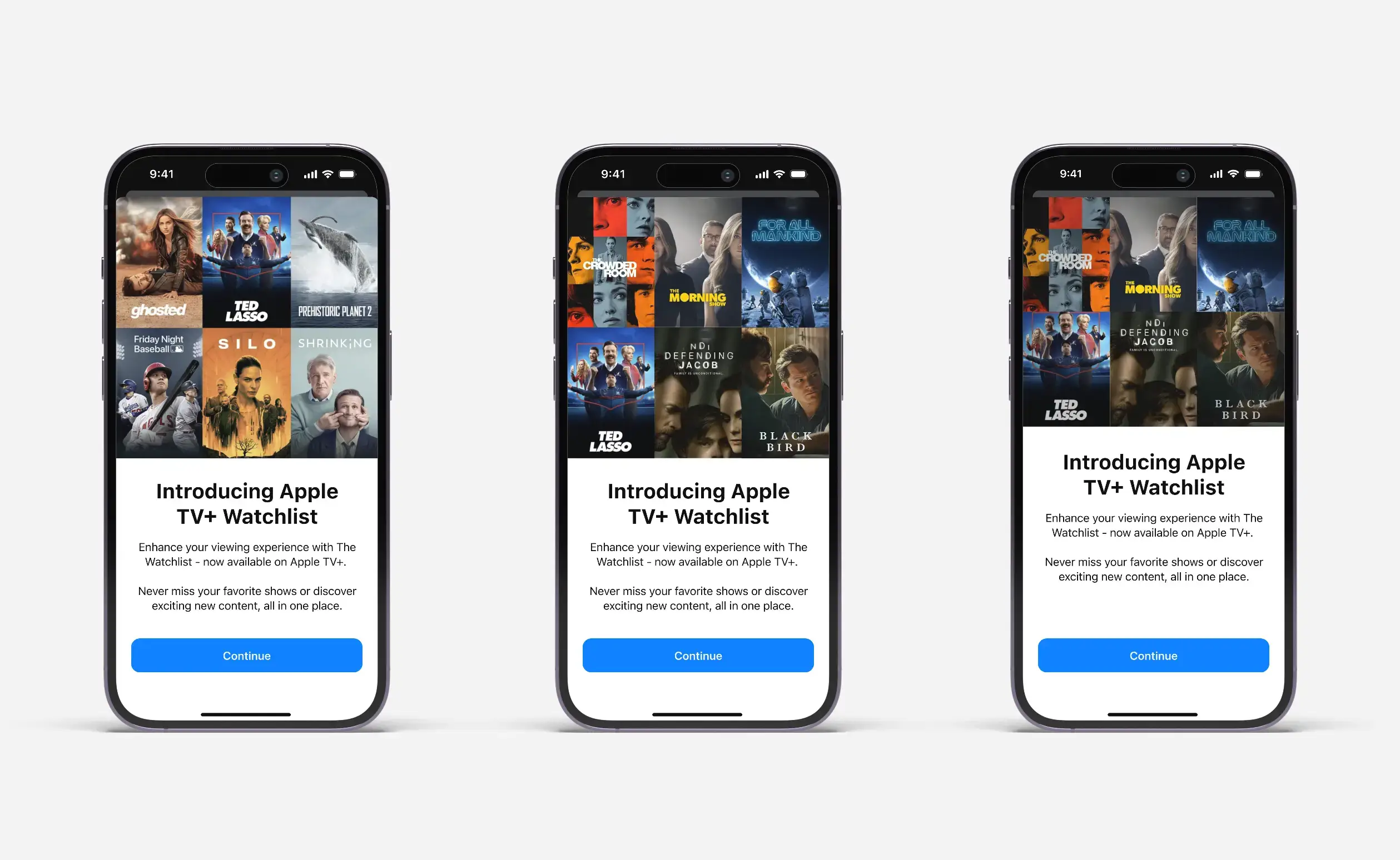
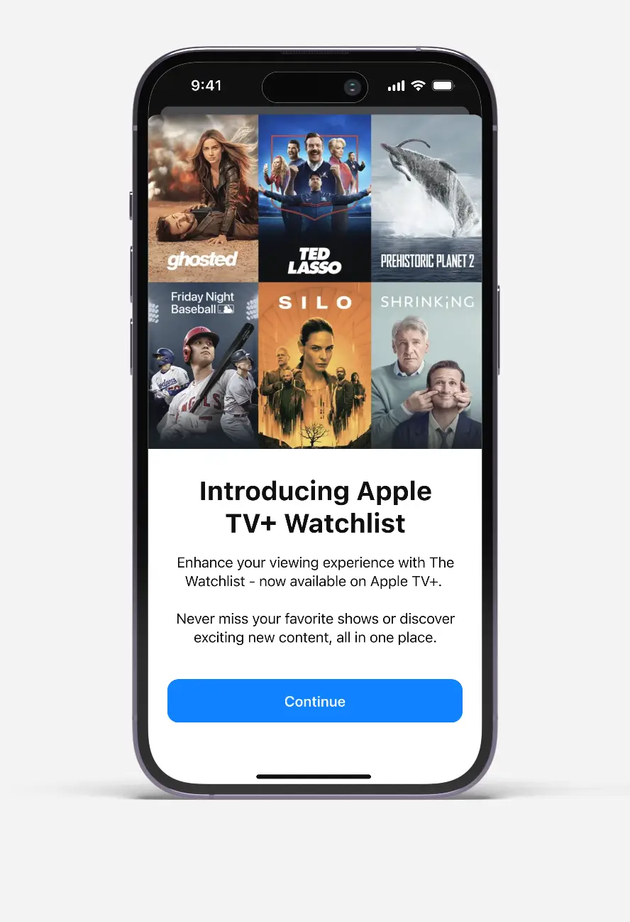
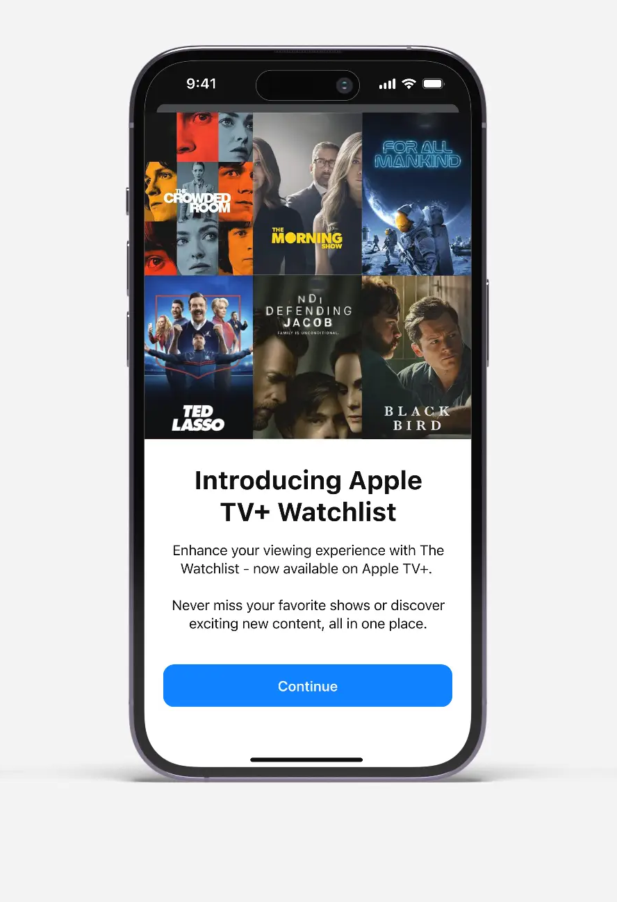
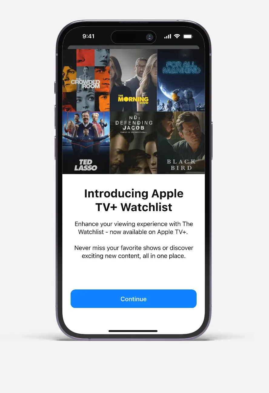
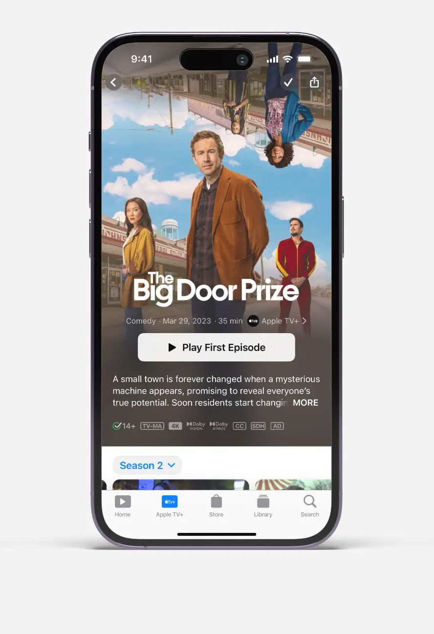
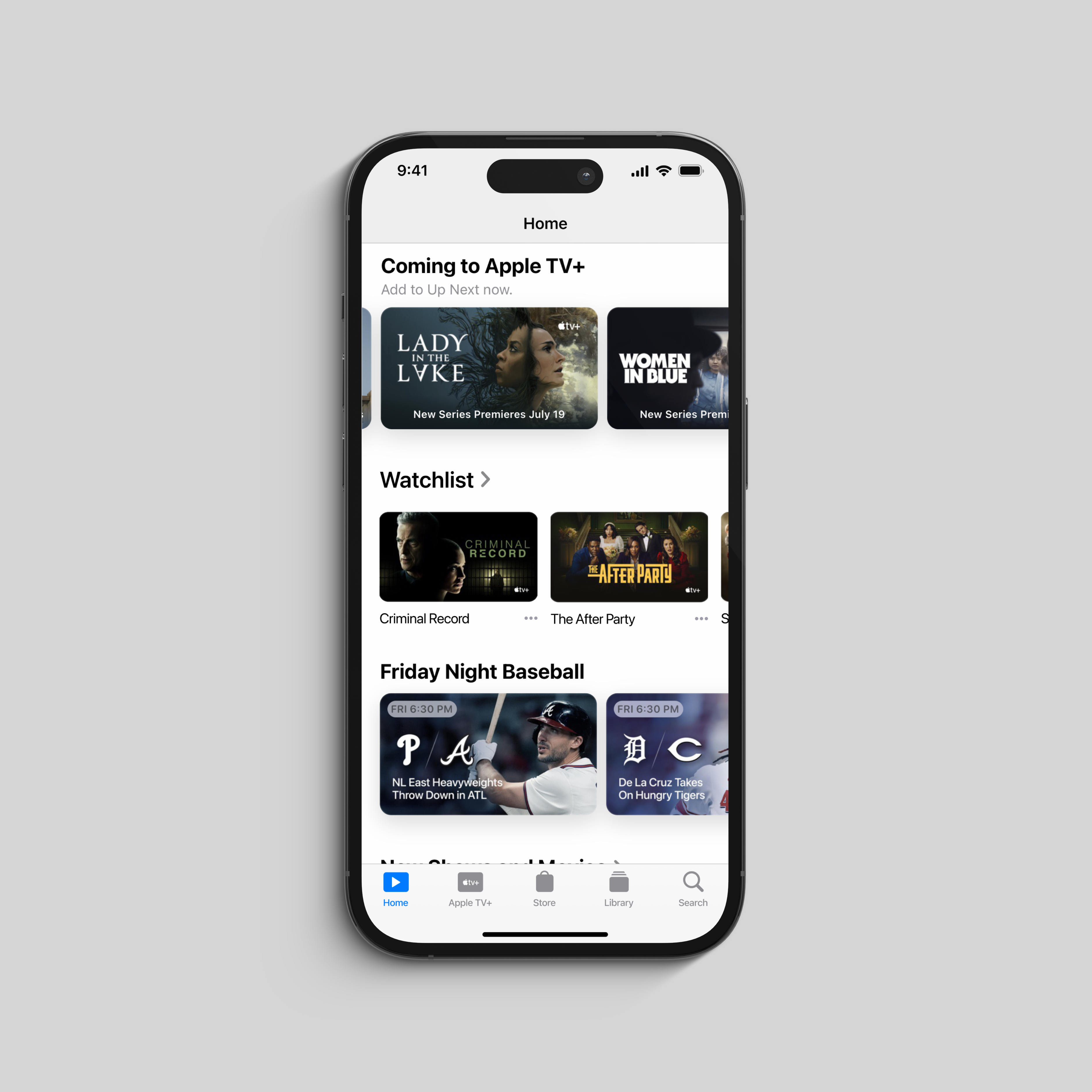
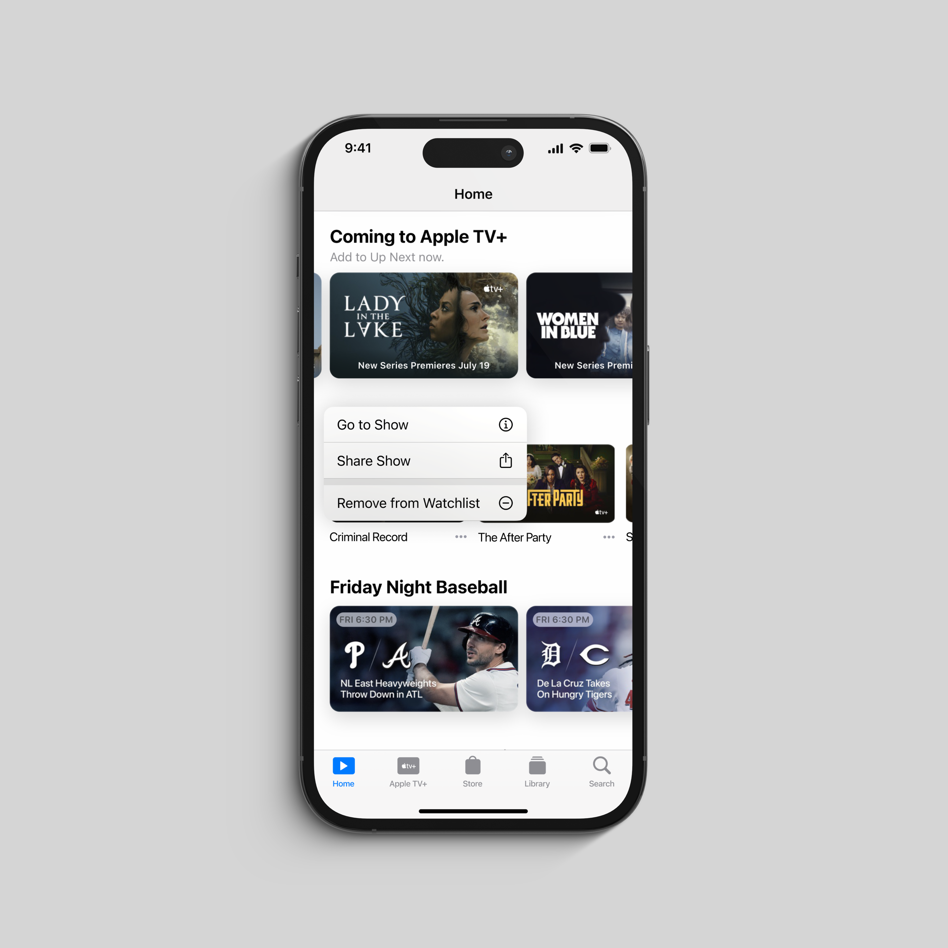
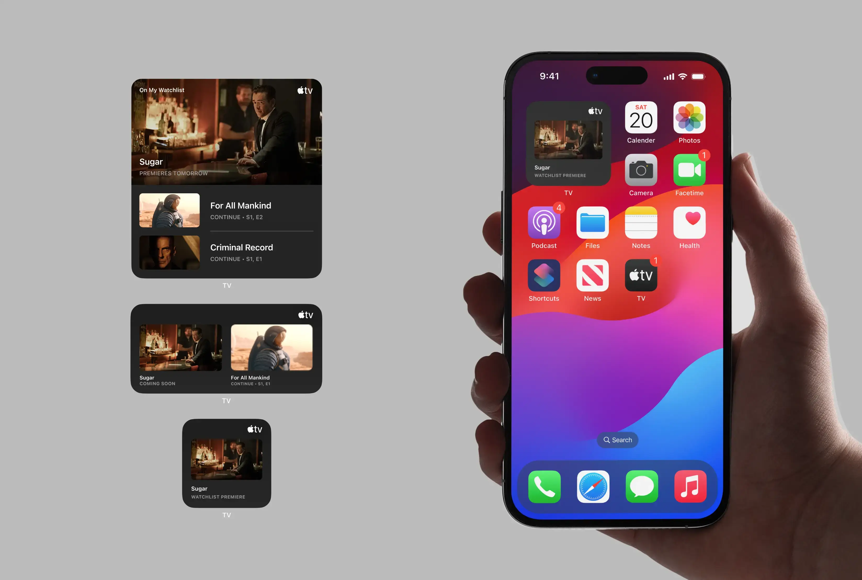
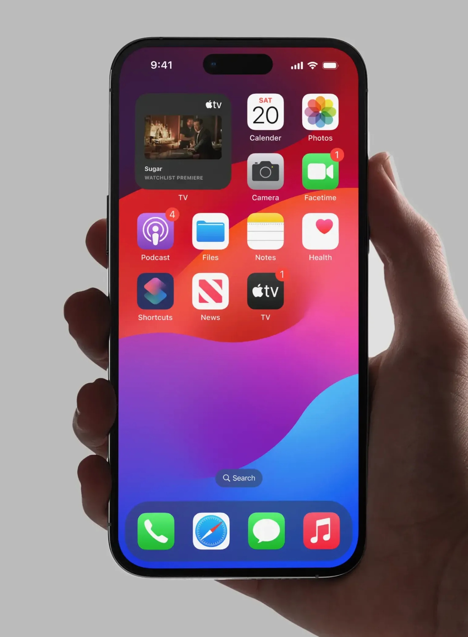
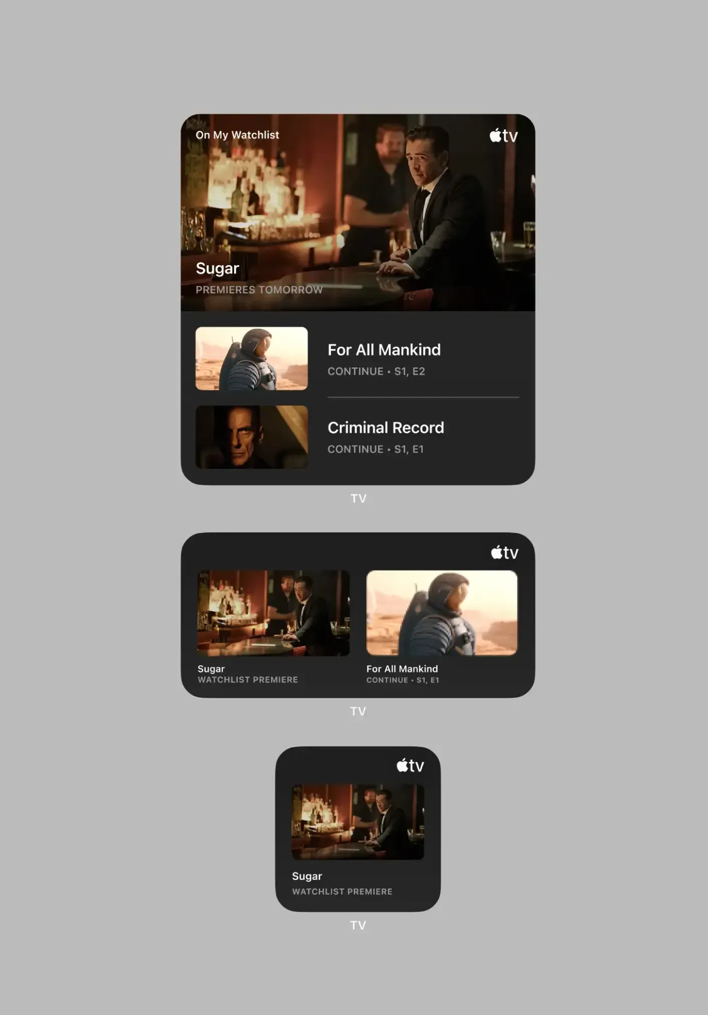
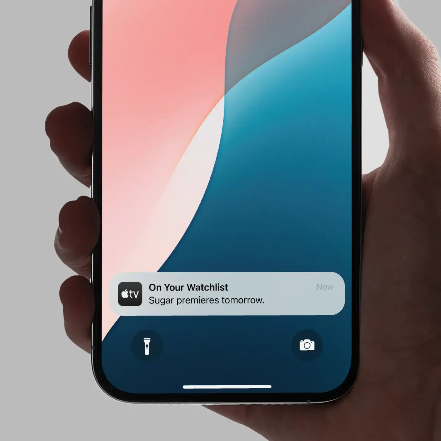
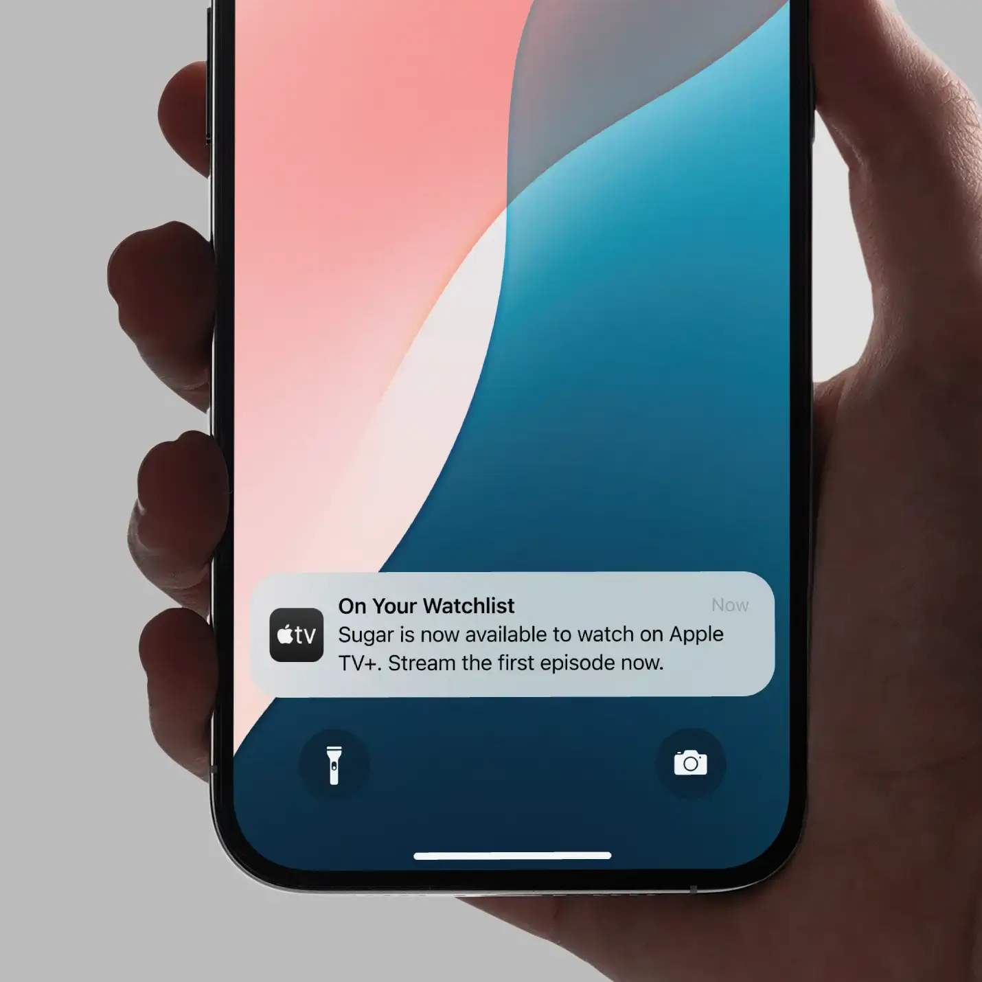
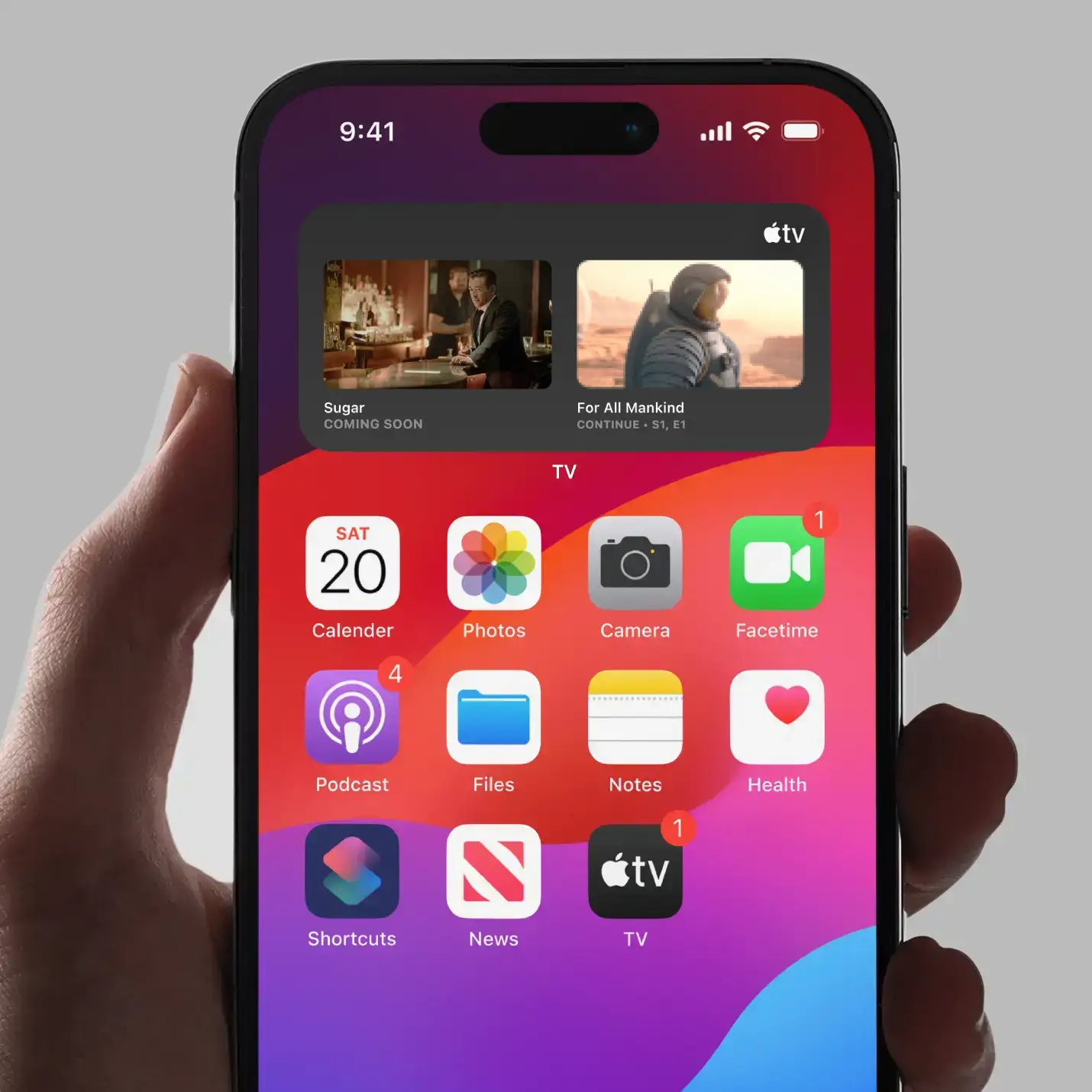
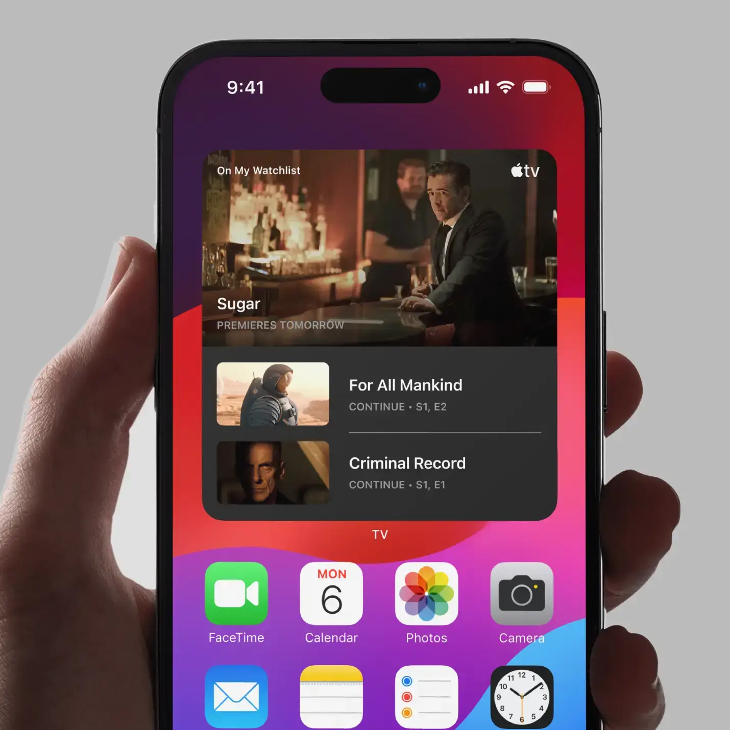
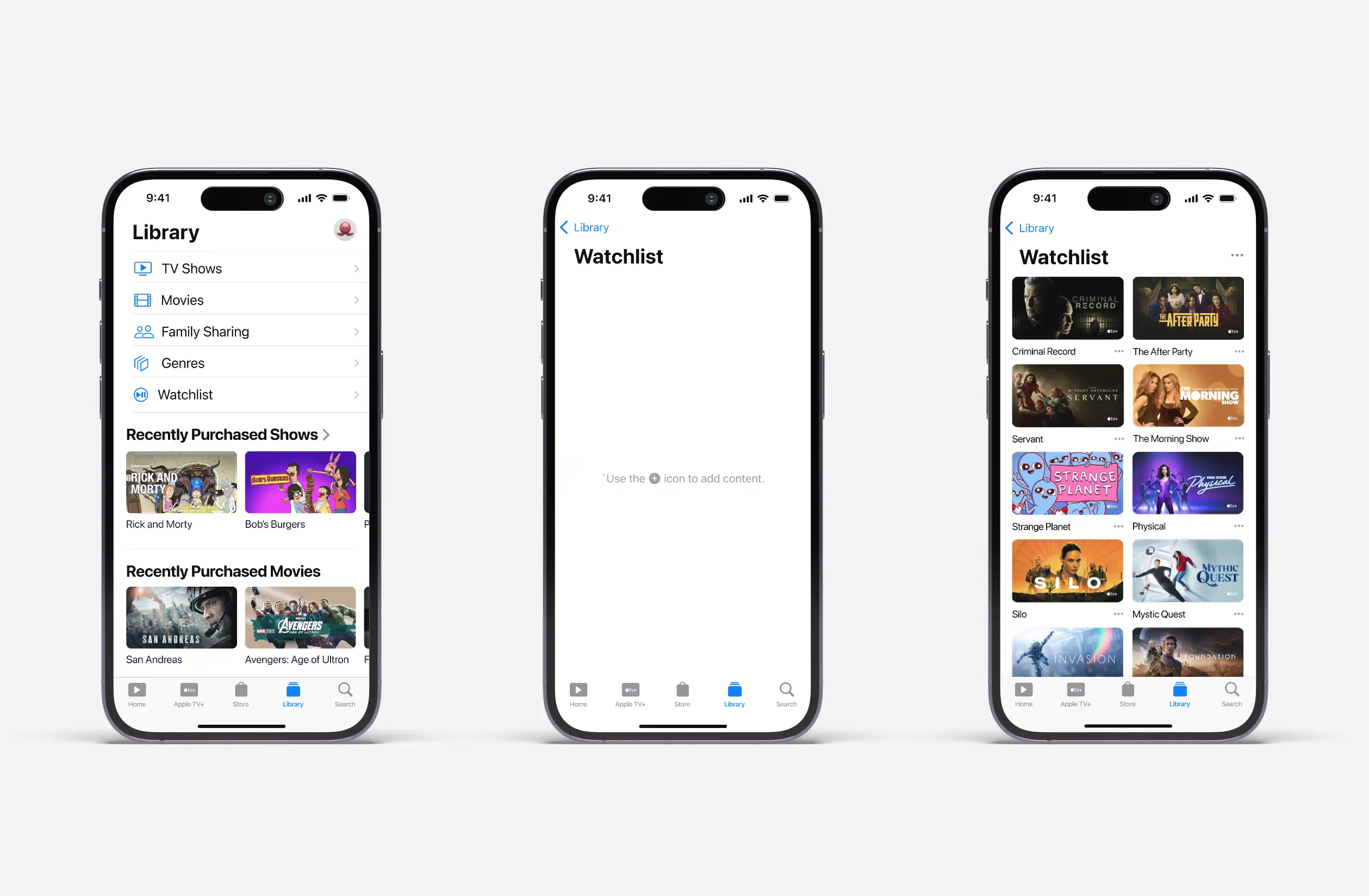
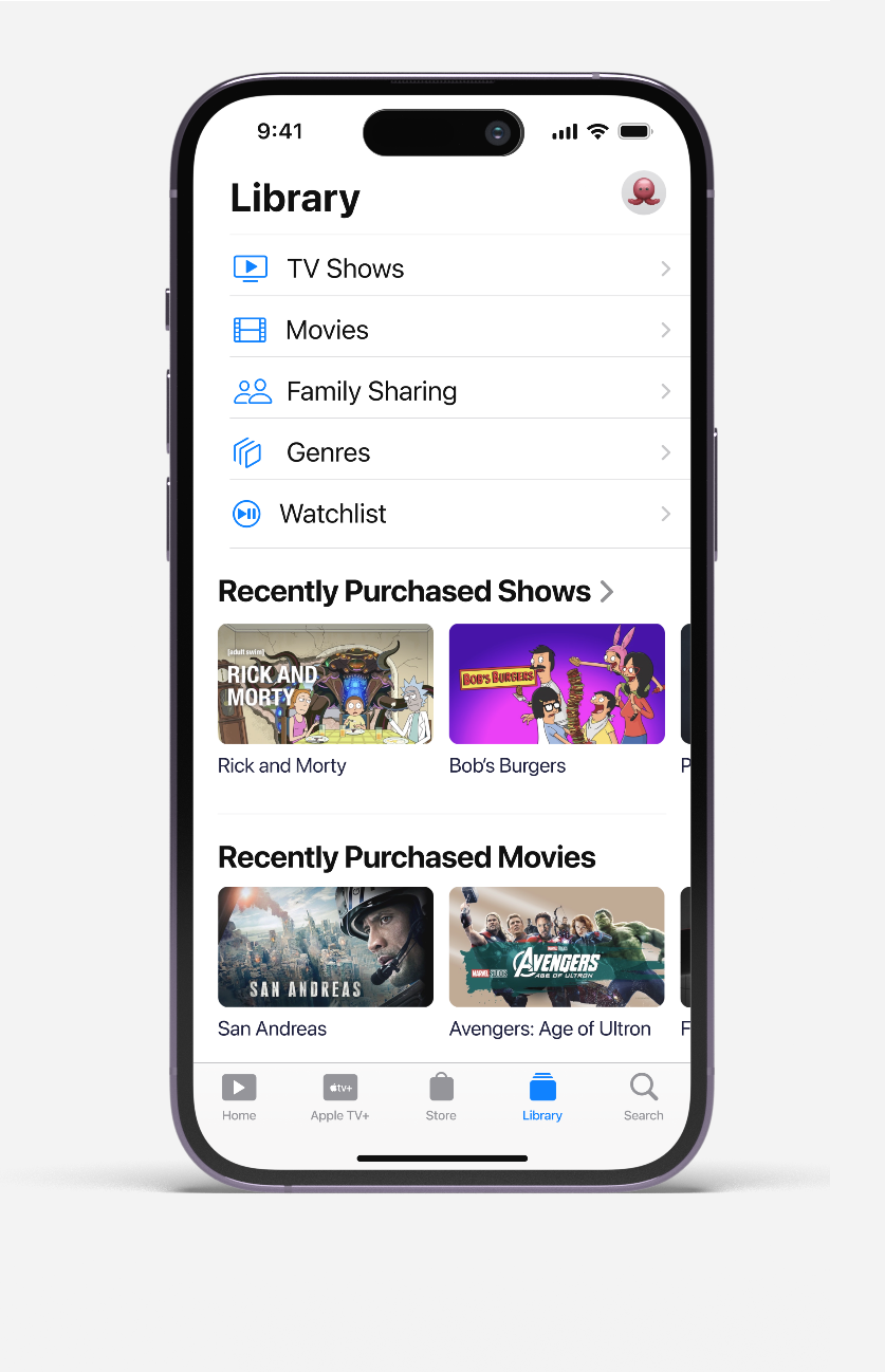
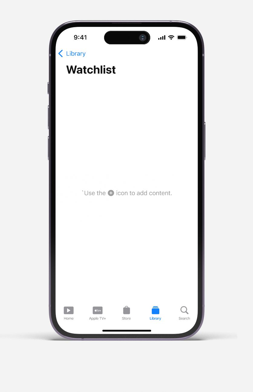
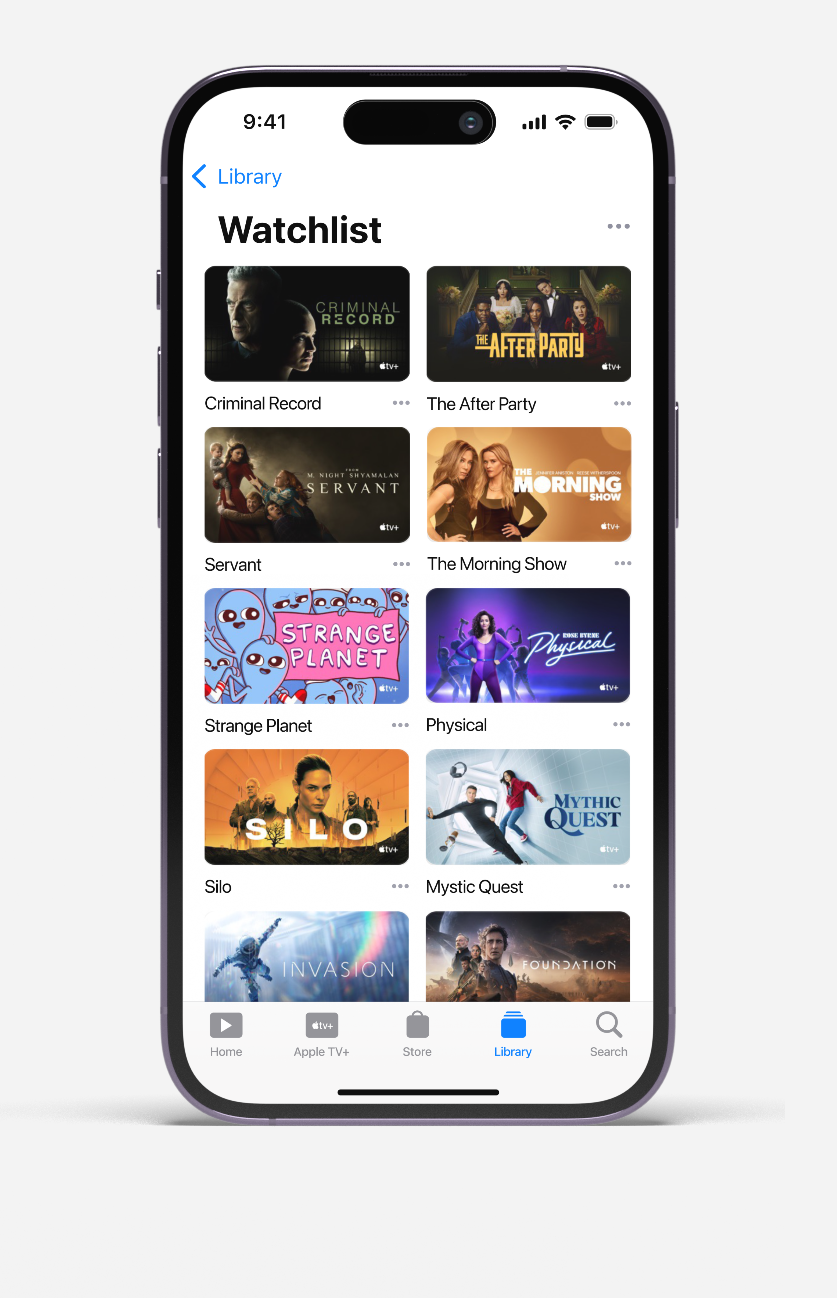
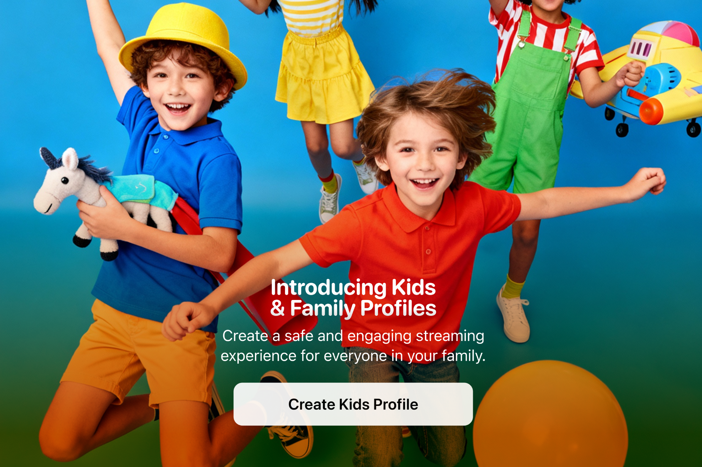
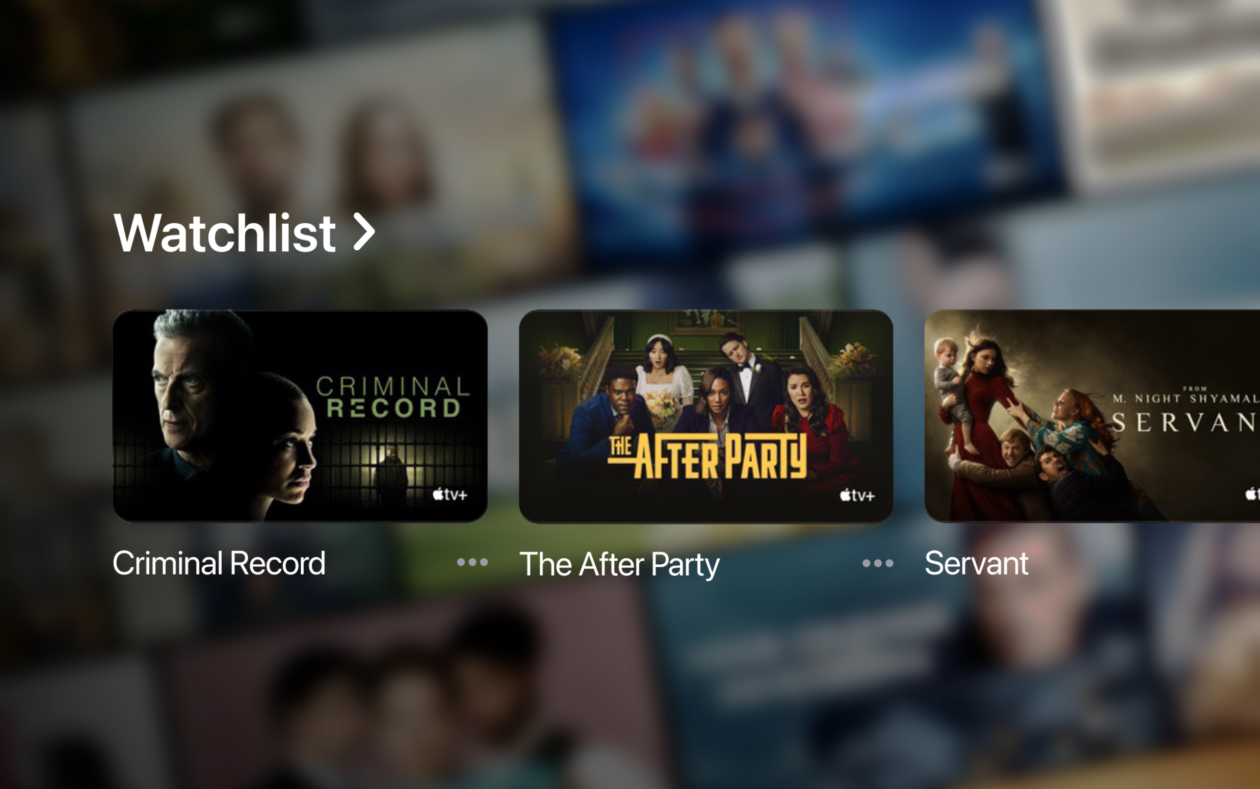
Designing the missing watchlist feature that 74% of streaming users demand and competitive streaming services have.
Apple TV+ is an American subscription-based streaming service operating in over 100 countries. Unlike Netflix or Hulu with vast content libraries requiring better discovery tools, Apple TV+ initially operated with a curated catalog. The assumption was simple: with fewer shows, users might not need advanced content management features like watchlists.
Apple TV+ was the only major streaming platform without a dedicated watchlist feature. While competitors like Netflix, Disney+, and HBO Max offered ‘My List’ functionality, subscribers relied on a cluttered ‘Up Next’ queue that mixed ongoing shows with future viewing plans.
• 74% of streaming users actively use watchlist features (HubSpot, 2022)
• 62M+ subscribers lacked basic content organization tools
• User dissatisfaction possibly driving churn and hindering acquisition
A 2022 study by Hubspot found that 74% of streaming users utilize watchlists. This suggests watchlists are a widely popular, adopted feature, proven by their widespread implementation. A 2023 Nielsen report revealed that 63% of users add watchlist content to plan their viewing, while 50% use them to remember what they want to watch later, highlighting practicality.
•
"It's so incredibly dumb... I can literally go to a show, see that I've added it to my list, yet the list is NO WHERE to be found."
•
"Literally the worst 'feature' or lack thereof on the Apple TV app. Ridiculous that it does not have a 'favorites' or 'my list' selection."
•
"Where are the saved shows??? That’s not normal behavior, to save a show and then have no way to see them. That’s actually abnormal."
•
"The ‘up next’ is NOT a ‘my list’ or ‘favorites’ like EVERY other streaming app❗️ ADD a favorite or my list because ‘up next’ IS what your customers are complaining about NOT what they WANT❗️"
•
If Apple wants to push a new show, subscribers can save it, thus likely increasing its viewership stats and maybe even indicating strong interest ahead of time.
•
A personalized watchlist creates a stronger emotional investment for the user in the platform. The more content a user has curated and saved, the more invested they feel in the service, making them less likely to cancel their subscription.
•
A watchlist may offer a dataset of user intent beyond just viewing history. This data can inform future show development, and more precise recommendations, for example.
My market and user research revealed 3 critical insights that would shape everything:
First, the "Up Next" confusion was real. Users consistently described feeling lost when trying to manage their viewing intentions. One user captured it perfectly: "I can literally go to a show, see that I've added it to my list, yet the list is NO WHERE to be found."
Second, users had clear mental models from other platforms. 74% of streaming users actively use watchlists elsewhere, meaning they came to Apple TV+ with established expectations. Fighting these patterns would be like swimming upstream.
Third, this wasn't just about organization—it was about intent. Users wanted to save content for two distinct reasons: 63% to plan their viewing schedule, and 50% as a memory aid for later. The current "Up Next" queue served neither purpose effectively.
Armed with these insights, I faced three interconnected challenges that would define the project's success (or failure, if I did not proporly recognize them ahead of time):
These insights distilled revealed 4 focus areas:
How might we integrate a watchlist feature into Apple’s streaming app to address user demand and improve content discovery?
→ Intuitive Interaction: Defining user interactions for adding, removing, and sorting saved content, utilizing design components.
How might we design a watchlist interface that seamlessly integrates with the overall Apple TV+ aesthetic?
→ Visual Design Cohesion: Designing the watchlist feature to visually align with the overall Apple TV+ aesthetic and functionality.
How might we design an intuitive watchlist functionality that caters to users' needs and preferences for effective content organization?
→ Information Architecture: Determining the optimal level of detail displayed within the watchlist, like episode progress or year of release.
How do you solve content discovery for a catalog when users expect the same organizational tools as platforms with thousands of titles?
Rather than diving straight into design, I took a page from my agile experience at a former employer and applied the MoSCoW framework to define what success really meant. This wasn't about building every possible feature - it was about shipping something that solved the core problem.
•
Add and Remove: Quickly and easily add and remove content from the library.
•
View all: If the watchlist library has reached at least 10 items, "View all" should be visible. "View all" will open their watchlist page, where the user can see all their content.
•
Intuitive Updating: If a user adds an upcoming release to their saved content, once the content is released, add it to the ‘Up Next’ queue.
•
Reminders: Send push notifications or in-app reminders on premiered content.
•
Reminders: Send push notifications or in-app reminders on premiered content.
•
Recommendations: Intelligent recommendations based on watchlist items.
•
Social Features: Users can share watchlist content to their social networks.
•
None.
Introducing Apple TV+ Watchlist - dedicated content organization that separates future viewing from in-progress content, matching industry standards while enhancing Apple's ecosystem.
Core Features Delivered:
• Instant add/remove from any content page
• Visual confirmation of saved status
• Seamless integration with existing UI patterns
• Automatic premiere notifications for upcoming releases
• Intelligent transfer from Watchlist to ‘Up Next’ when content releases
• Grid-based organization with essential filtering options
• Positioned below ‘Browse by Genres’ for optimal visibility
• Accessible through Library section for power users
• Clear visual distinction from the "Up Next" queue
Introducing Watchlist
I explored a few versions of the interstitial, shown to the subscriber upon launching the app. The interstitial screen will introduce the new Watchlist feature, with a vivid display of the most recent, popular movies and shows and a "Continue" button to proceed to the homepage. Ultimately, I chose the design with the best visual balance.
Add to Watchlist
The Watchlist feature integrates seamlessly across Apple TV+, replacing the functionality that previously added a subscriber's saved content to the already cluttered "Up Next" queue. This allows subscribers to save content with a simple tap. Shows are instantly added with visual confirmation and status indicators.
Below: Show detail pages with Watchlist integration - checkmarks in the top-right corner indicate it's saved content making saving and removing shows easy.
Placement
The Watchlist section is strategically positioned within the app's information hierarchy to balance discoverability with user intent. A/B testing confirmed the watchlist placement over previous iterations and testers felt that it was clearly distinguishable from the "Up Next" queue while still being quickly discoverable.
When a show or movie that is near premiere or has premiered, the TV+ widget will update accordingly with the appropriate context for its varying sizes. For example, for a newly premiered watchlist TV show, the smallest widget will say "Watchlist Premiere."
Push notifications are strategically timed to maximize engagement. When a show or movie has premiered or is near its premiere, a push notification is sent, reminding the subscriber, and navigating them to their show.
Watchlist Management
Easily access your Watchlist by going to Library → Watchlist. Your child's watchlist (see prior project) can also be viewed here. This Library section serves as the central hub for organizing your Apple TV+ content and managing your entertainment easily.
Why Separate from "Up Next"?
User research revealed that 63% of users add watchlist content to plan viewing, while 50% use it as a memory aid. Mixing planned content with in-progress shows creates cognitive overload.
The Notification Strategy
Rather than overwhelming users, I designed contextual notifications that are pushed when watchlisted content premieres - transforming passive saves into active viewing triggers.
Visual Hierarchy for Content Promotion
The watchlist placement strategically promotes Apple's original content while giving users control over their viewing pipeline, creating a win-win for discovery and satisfaction.
• Feature Adoption: More active users creating watchlists within 60 days
• Content Discovery: An increase in non-trending content consumption
• Watchlist-to-Viewing Conversion: Saved content watched within 30 days
• Churn Reduction: A decrease in subscription cancellations among watchlist users
• Engagement Boost: An increase in session duration for users with active watchlists
• Content Promotion: An improvement in premiere day viewership for watchlisted shows
To my surprise, Apple launched this feature in October 2024, confirming the market need and design approach I took nearly identically with the exception of the Watchlist page.
Sometimes the best design solution is implementing proven patterns that users expect, rather than reinventing familiar interactions.
The Apple Forum complaints weren't just feature requests - they were retention signals that translated directly to revenue impact.
The most successful features often solve the simplest problems. A basic save-for-later function generates more engagement than other recommendation patterns.
Future Opportunities
With the foundation established, the next iteration could explore:
• Social watchlist sharing to drive viral content discovery
• AI-powered watchlist recommendations based on saved content